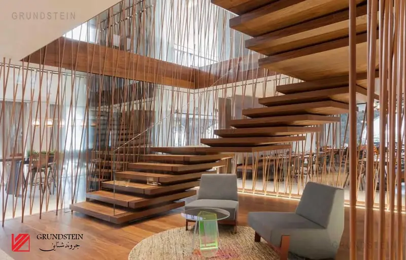
Interior Design Components And Elements
What are the components and elements of interior design?
When thinking about interior design, words like creativity and flair immediately come to mind, but many will be surprised to find a degree involved. Professional interior designers usually follow a set of informal “rules,” based on specific interior design principles and elements. These interior design components and elements include space, lines, shapes, light, colour, texture and pattern; Keeping it balanced is key to creating aesthetically pleasing designs. In addition to improving the look of a room, making these elements work together in harmony will also increase functionality to begin with. The interior designer will evaluate the room according to these interior design elements, and then use them to hide or enhance the various features and defects of the space. At a minimum, the following seven elements should always be considered when creating any interior design.
Void
One of the most important components and elements of interior design and the foundation of interior space, space is an essential concept to understand, ensuring that you are better equipped to take advantage of what is available to you. Available ‘space’ usually can’t be easily changed (although a designer can sometimes enjoy doing so), so you need to work with what you have within the physical confines of a room in our interior design for the luxury of working within a 3D space (length, width and height). This 3D space can be filled in or left blank, depending on what you need to achieve from a function and design perspective. Space can be divided into two categories: positive and negative space. Positive space is a space that contains objects, while negative space is open/empty space (including any space between objects). Balancing the negative and positive spaces in the room is also essential to avoiding overcrowding. This balance will be affected by the client’s needs in the specific area/room and the functions required. For example, negative space is required for traffic paths. It is also important to consider the size and size of the furniture and objects placed in the room, as they can be used to make the space appear larger or smaller given the desired result. For example, giving height like bookshelves can give the illusion of height. Different design styles will give the same to different uses of space. For example, a simple design will have a much larger negative area than the average selective design.
lines
Horizontal, vertical and dynamic lines help shape a room and guide the eye. Creating lines using room furniture and structural design can create harmony, unity, and contrast. The horizontal lines, created by tables and other surfaces, give a sense of stability, form and efficiency. Interior designers highlight horizontal lines to make a room appear wider and taller, and to draw the eye into a focal point. But be warned, an overemphasis on horizontal lines has the potential to make a space look boring and uninspiring. Vertical lines, created by features such as windows and doorways, evoke feelings of freedom and power. On a functional level, distinctive vertical stripes often give the illusion that the room is taller. Often suitable for use in dining rooms, entryways and offices, vertical lines should be combined wisely so as not to leave residents feeling uncomfortable. Dynamic lines refer to diagonal, zigzag or curved lines. These lines can be found on stairs, for example, and provide energy and movement. Stimulating the eye, the dynamic lines hold our attention for longer. However, too many dynamic lines in one room can be distracting, and ideally overcome horizontal or vertical lines, interior designers will strike a balance by incorporating different lines. This is usually done by choosing a distinctive and dominant font, according to the client and the desired feeling they wish to convey in the space.
the shape
It’s the shape of the room as well as any things inside the room. In other words, it has to do with the physical form of anything three-dimensional. Shapes can usually be described as geometric or natural. Geometric shapes refer to solid lines and square edges, which often appear to be man-made, while nature relates to more organic shapes that appear to have been created by nature. Forms can also be open (objects that can be viewed or closed) on their own. Another thing to keep in mind with the shape is the proportions and size of the room compared to the things placed inside. Adding one of the similar shapes can bring harmony and balance, while adding too many different shapes can lead to confusing results. A space is usually more interesting if the dominant motif is repeated in small things throughout the room.
the light
Natural or man-made light is a crucial aspect of any space. Without it, all other elements would not be able to shine to their fullest potential. Light can be divided into the categories of task lighting (the specific purpose), accent lighting (focusing on things) and mood lighting (adding ambiance). When considering lighting, it is important to address the activities that will be done in the space. Both quality and quantity must be evaluated here. For example, the office will need bright lighting so that workers can see clearly and take alert action. On the other hand, living room lighting can be applied with a softer touch. The application of dimmer light has the ability to make a space more diverse. Natural lighting should always be considered, and it can be addressed by clever placement of doors, windows and even mirrors. Apart from the functional purpose of light, it has the ability to adjust the condition and atmosphere in space while defining color, line and texture. In addition, any good interior designer also knows that additional fixtures.


4 comments